Major League Baseball’s new look pays homage to the sport’s history
Major League Baseball has a new look, courtesy of an all-star lineup of type designers.
In 2020, after MLB moved to its new headquarters in New York City, it reached out to Mother Design, the branding and design agency behind work for brands like Cadillac, Tripadvisor, and the scented water bottle Air Up. The league was looking to expand professional baseball’s fandom and talent, and it wanted its visual identity to feel unified.
Beginning in late 2022, Mother Design started building out MLB’s new brand architecture, which was introduced beginning in 2024 on a rolling basis. The league’s famous silhouetted batter logo, designed in 1968 by Jerry Dior, was left untouched, but MLB’s wordmark was updated to fit into larger visual system that’s now complete.
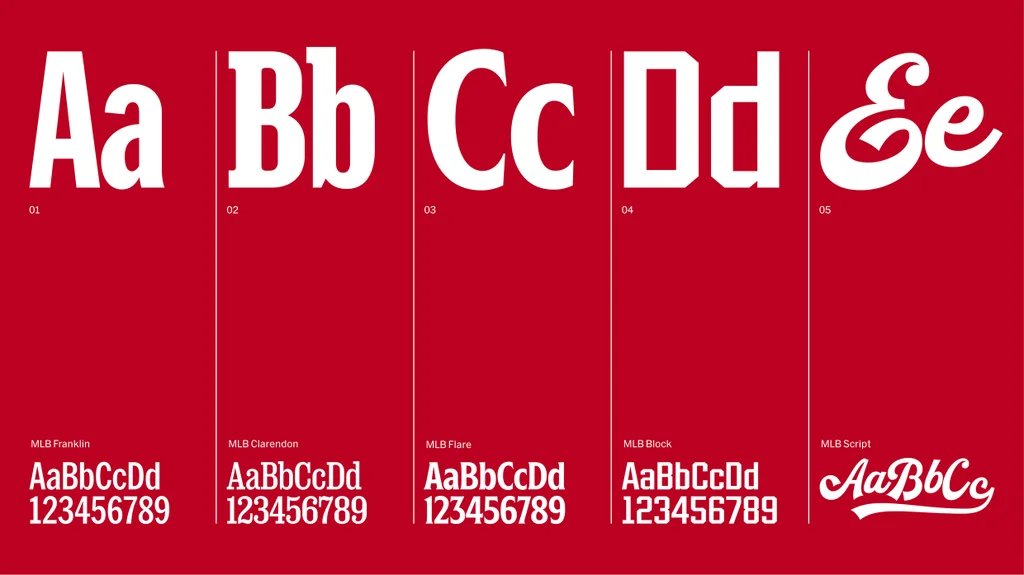
As part of the multiyear brand refresh, the agency tapped five type designers or foundries chosen for their individual specialties to build out a one-of-a-kind font book that shows up across the league, from its Ballpark app and venues to social channels and special events.
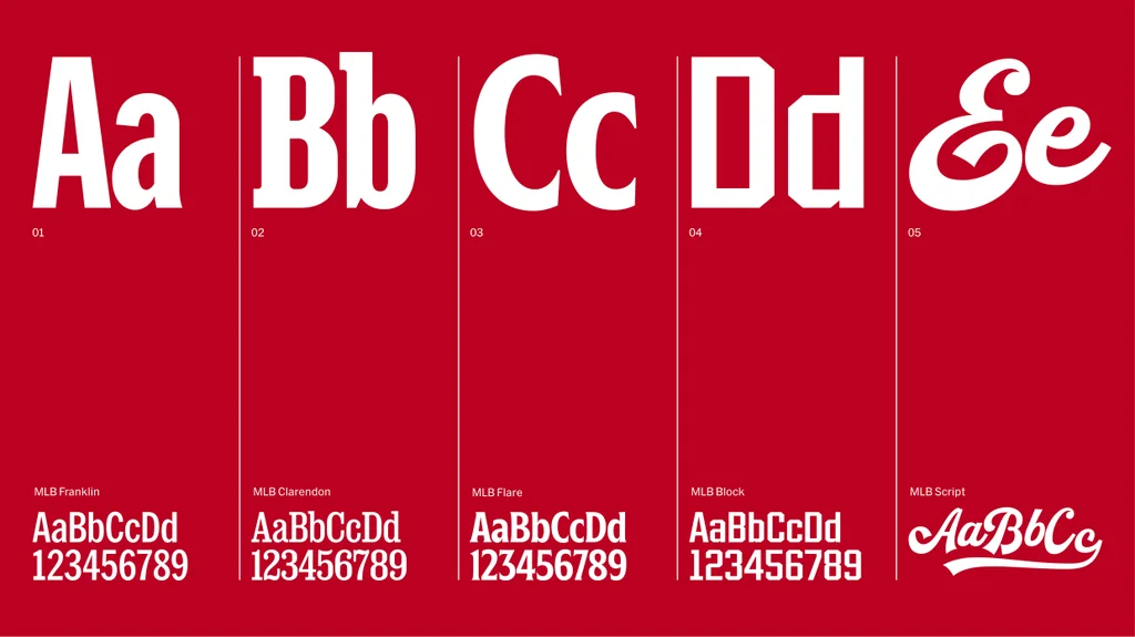
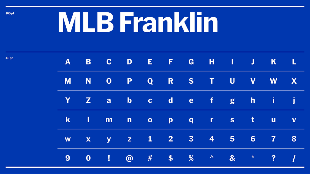
Each font in the brand—MLB Franklin, MLB Clarendon, MLB Flare, MLB Block, and MLB Script—was chosen because it’s a style that was present in baseball in the early 20th century in some form or another.
“It’s ensuring that we’ve got these visual cues and these letterforms that have been part of our visual vernacular for longer than any of us have been alive,” Mark Sloan, Mother Design’s New York City head of design, tells Fast Company. “How do we make sure that we carry that forward and we honor that tradition, but that we build them in a way that is prepared for retina screens and extremely small spaces as well as emphatic, large moments. That’s really the crux of it.”
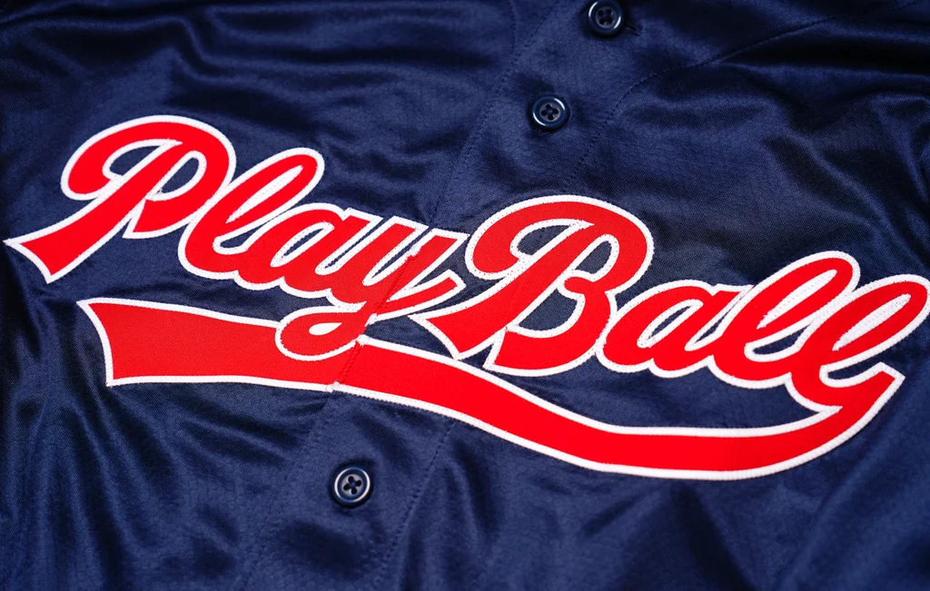
The typographers for the project were purposefully enlisted. MLB Script was designed by the Bay Area foundry OH no Type Co., which was selected for its attention to unexpected quirky details. The variable typeface includes flags, the horizontal stripe from a word’s final letter that underlines the word and looks quintessentially baseball.
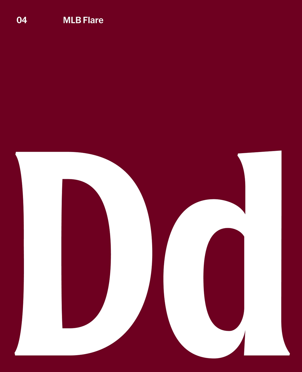
MLB Flare has a handlettering style designed by the Uruguayan foundry Tipotype. The aim is to feel warm and charming, and to reflect and honor the cultural connection between baseball and Latin America.
“There is a long tradition of Latin American players in MLB, so the Latin influence is naturally part of the game,” Tipotype’s cofounders, Martín Sommaruga and Vicente Lamónaca, say in an email. “The Latin community also has a strong presence not as a distinctive feature, but as a fundamental part of the sport itself.”
The type designer Nick Sherman designed a customized version of MLB Franklin, a classic American grotesque-sans serif used on scoreboards that could be seen in stadiums during the recent World Series. MLB Clarendon is similarly a customized version of a classic slab-serif font found throughout baseball history, to which the type designer David Jonathan Ross gave added flexibility in weights and widths.
Skye Dillon, a type designer who specializes in sports branding and designed the 2026 MLB All-Star Game style guide, designed the octagonal MLB Block. It’s based on letterform found on jersey names and numerals and lettering at venues like Ebbets Field, the now-vanished ballpark where the Dodgers played when they were based in Brooklyn.
Research for the brand refresh included books, baseball cards, ticket stubs, felt letters, and individual clubs’ venues, history, and ephemera. The goal was to find visual through lines that go back the furthest but still feel relevant, as if they were designed today, says Sloan, Mother Design’s head of design.
Baseball is rich with typographic inspiration, from jersey lettering and numerals to logos like the interlocking NY monograms for the Yankees and Mets. Sloan compared baseball to “a visual history of the country itself,” and says it’s arguably responsible for keeping a lot of typographic styles alive and relevant in pop culture.
“If you look at something like baseball script, for example, it’s something that as Americans, it’s in our visual consciousness,” Sloan says. “It sort of comes in and out of fashion in the world of branding, but it’s always been in fashion in baseball.”